

Most of us pick our clothes in the morning based on what’s clean, what fits, and vaguely what mood we’re in. Colour theory doesn’t usually enter into it. But there’s a real reason why you step out in certain shades and feel like a different person, and why other colours leave you looking a bit washed out before you’ve even had your coffee.
It’s not mystical. It’s not particularly complicated either. But it does explain why the same navy jumper can look brilliant on one person and completely flat on someone else standing right next to them.
Skin Tone Is the Starting Point
The big thing most people overlook is the relationship between clothing colour and their own skin’s undertone. Not the surface colour, but the undertone beneath it, which tends to run either warm (golden, peachy, yellow-ish) or cool (pink, red, bluish). Some people are fairly neutral, which honestly makes life easier.
If you’ve got warm undertones, earthy colours tend to do something good for your face. Terracotta, olive, warm camel, rust. They seem to pick up something in your complexion that cooler colours just don’t. And if you’ve got cool undertones, you’ll likely find that jewel tones, navy, deep plum, and icy blues actually make you look more awake than a strong orange ever would.
This is the core of what makes certain colours work better for different people, and it’s worth actually thinking about rather than just defaulting to whatever’s on the sale rail. Once you know your undertone, shopping gets a lot less hit and miss.
Contrast Matters More Than People Think
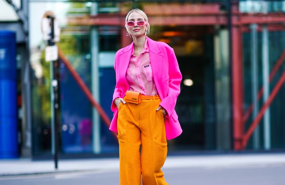
There’s another layer to this, which is about contrast. Some people have high natural contrast between their hair, eyes, and skin. Think very dark hair against pale skin, or bright eyes against deep colouring. Those people can carry bold, high-contrast outfits without looking overwhelmed. A black-and-white print, a strong block colour, something graphic. It all tends to land well.
Lower-contrast colouring, which includes things like medium brown hair with medium skin and light eyes, often looks best in softer, more tonal combinations. Not because those people can’t wear colour, but because very harsh contrasts can end up fighting their natural colouring rather than working with it. A dusty rose or a soft slate blue often does more for someone with lower contrast than a stark red-and-black combination would.
Nobody really teaches you this stuff, which is why so many people spend years buying the wrong things and never quite knowing why.
The Psychology Bit Isn’t Just Nonsense
Beyond how colour interacts with your skin, there’s also what it communicates. Red does genuinely signal confidence and energy in a way that beige just doesn’t. Studies have found that people wearing red are often perceived as more assertive, and in some research, even more attractive. Whether you buy into that or not, most people have experienced wearing a colour that made them feel different. Less invisible, maybe.
Blue, particularly darker navy, reads as trustworthy and calm. It’s why it dominates professional environments, and also why it’s so easy to wear without really thinking about it. Green has had a significant resurgence partly because people associate it with health and calm, which probably explains why it’s all over lifestyle and wellness branding right now. Colour does carry meaning, even when you’re not consciously sending a message.
So What Do You Actually Do With This?
The honest answer is that you don’t need to overhaul everything. Start by noticing what you get the most compliments in, because that’s usually your clue. If three separate people have said you look great in that teal shirt, it’s not a coincidence. Your wardrobe is already giving you data you haven’t fully read yet.
The other thing worth doing is trying colours you’d normally walk straight past. Not every experiment works out, but the ones that do can genuinely shift how you feel about getting dressed in the morning. Colour isn’t a minor detail sitting on top of your outfit. It’s often the thing that makes the whole thing land, or not. And once you start seeing it, you can’t really unsee it.